Client
Where Eagles Fly The Musical
The Work Credit Brian Communications
Visual Identity
Art Direction
Social
Design
Role
Senior Designer / Lead Designer
Creative team
Kim Holdredge
Sean Flanagan
RJ Trumble
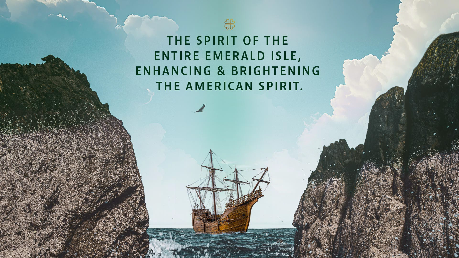
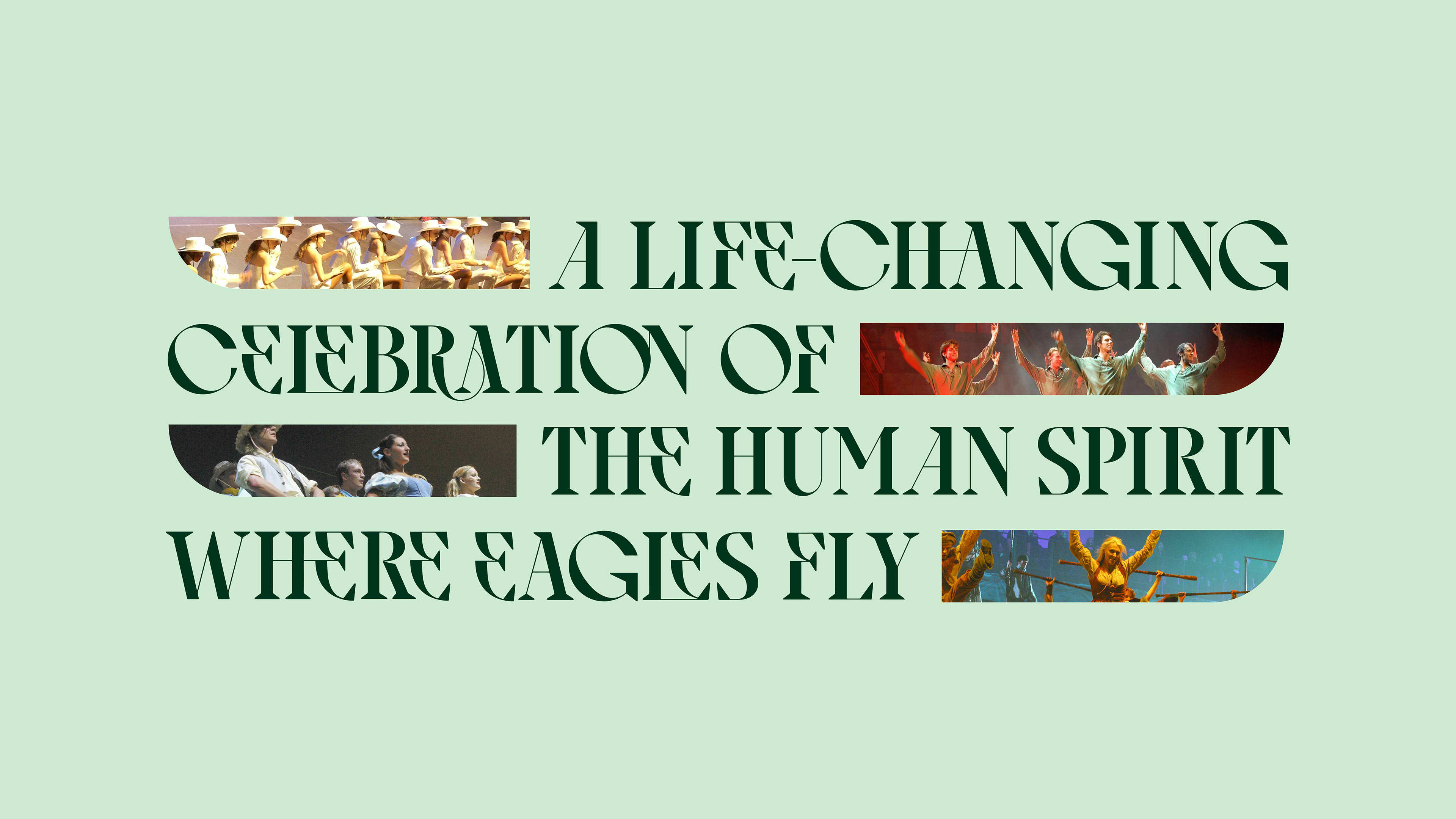
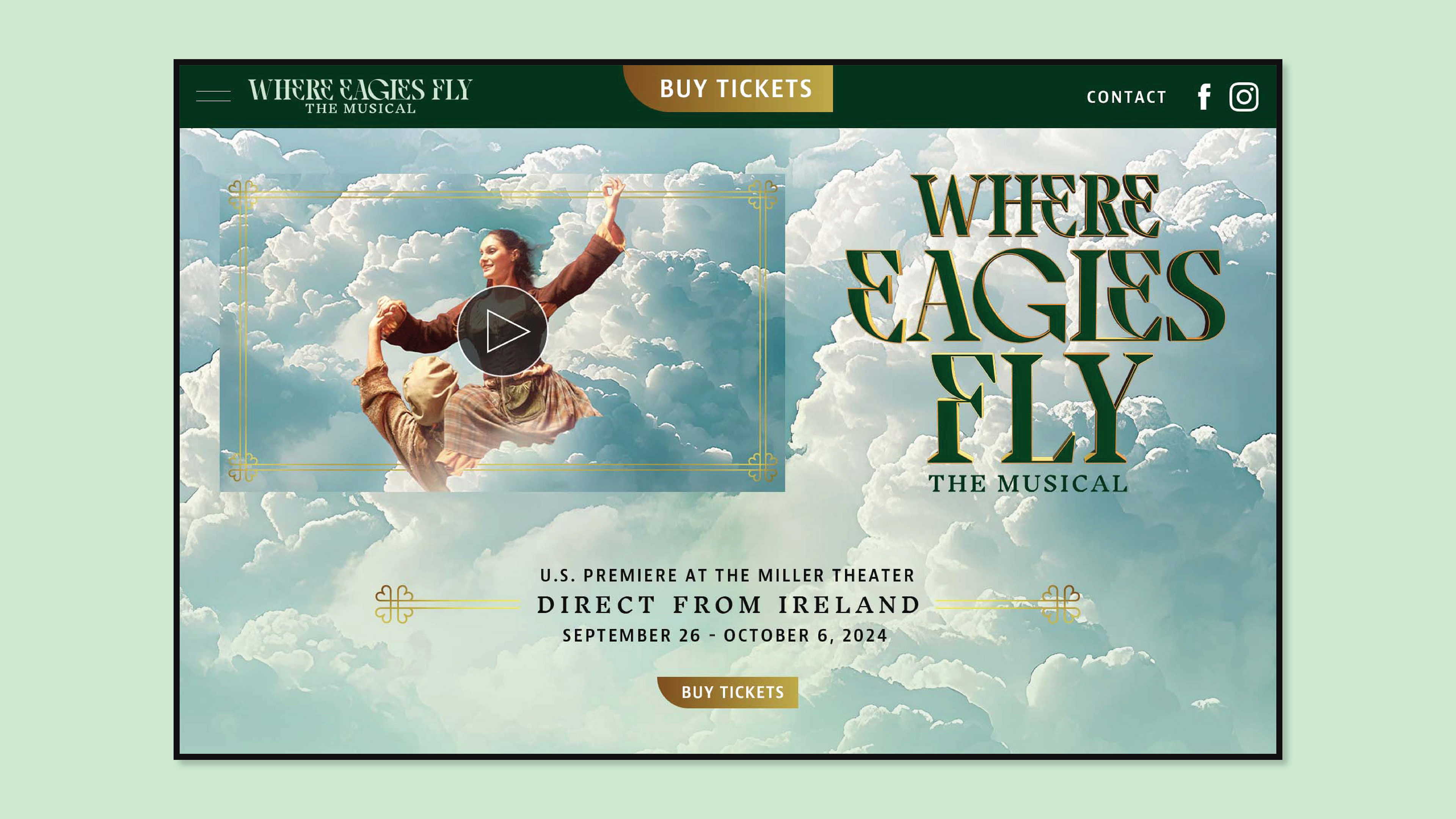
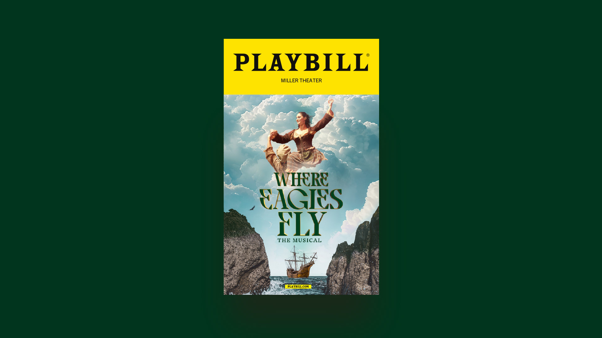
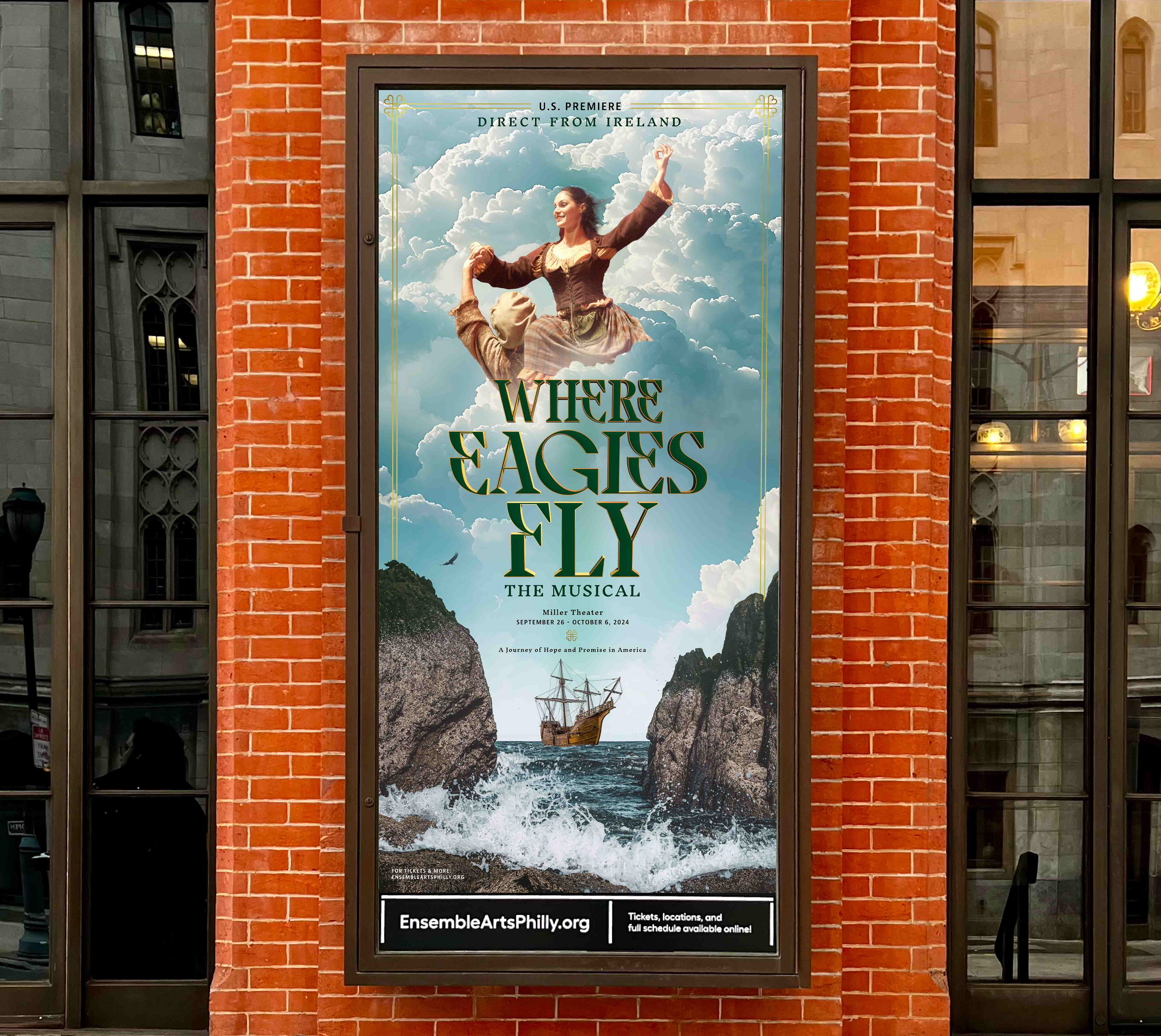
Where Eagles Fly is an Irish musical centered on emigration from Ireland and the pursuit of hope in America. The work focused on refreshing the visual identity using existing show assets, reworking them to better reflect the show's themes and connect with its intended audience.
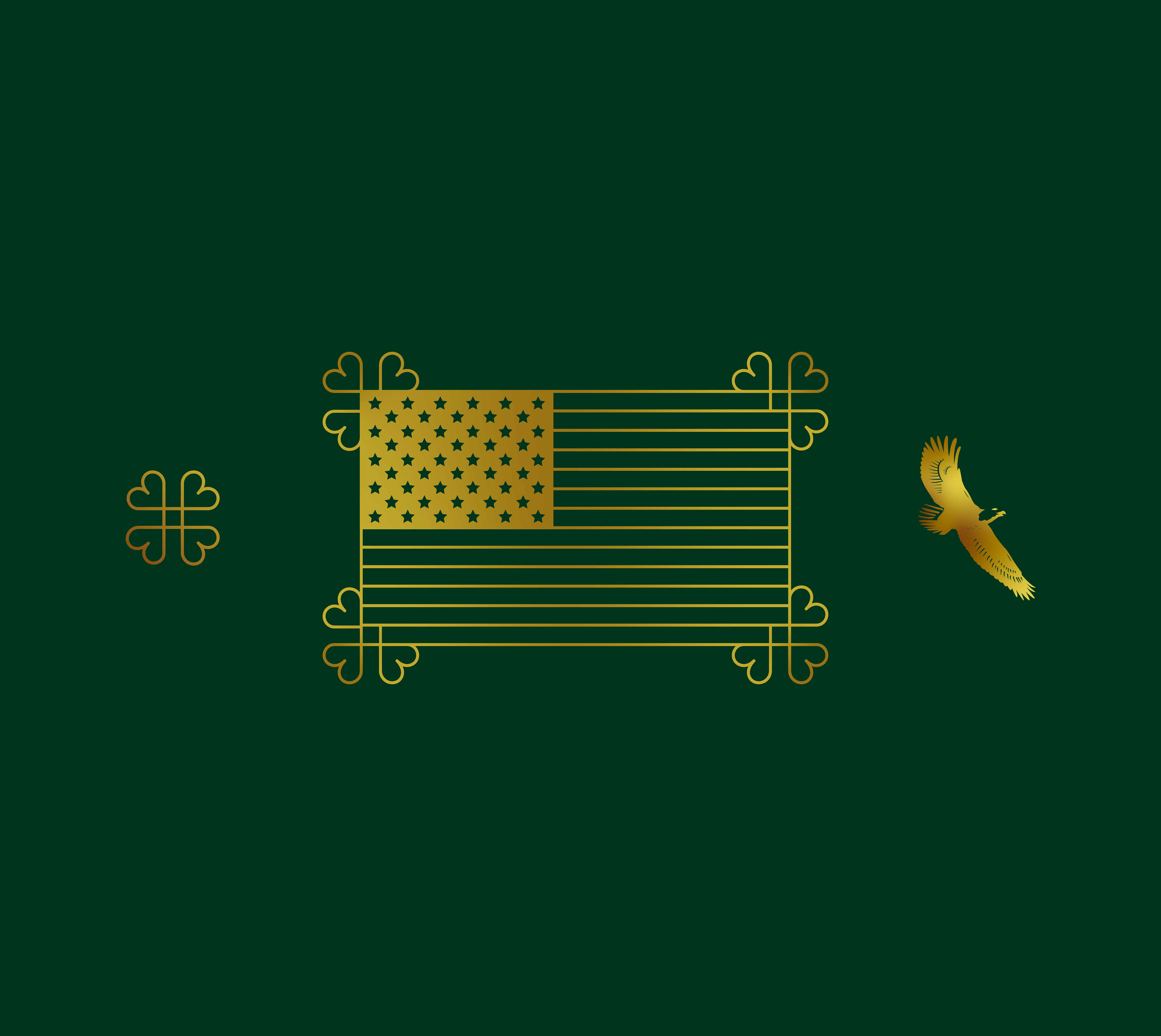
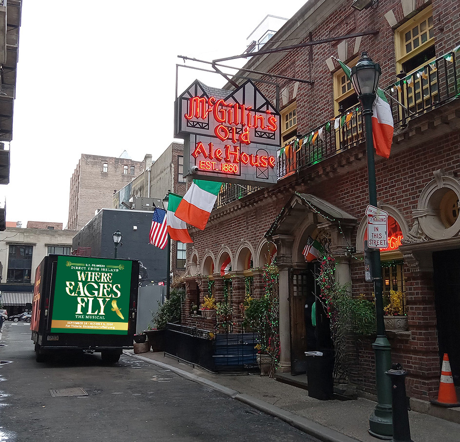
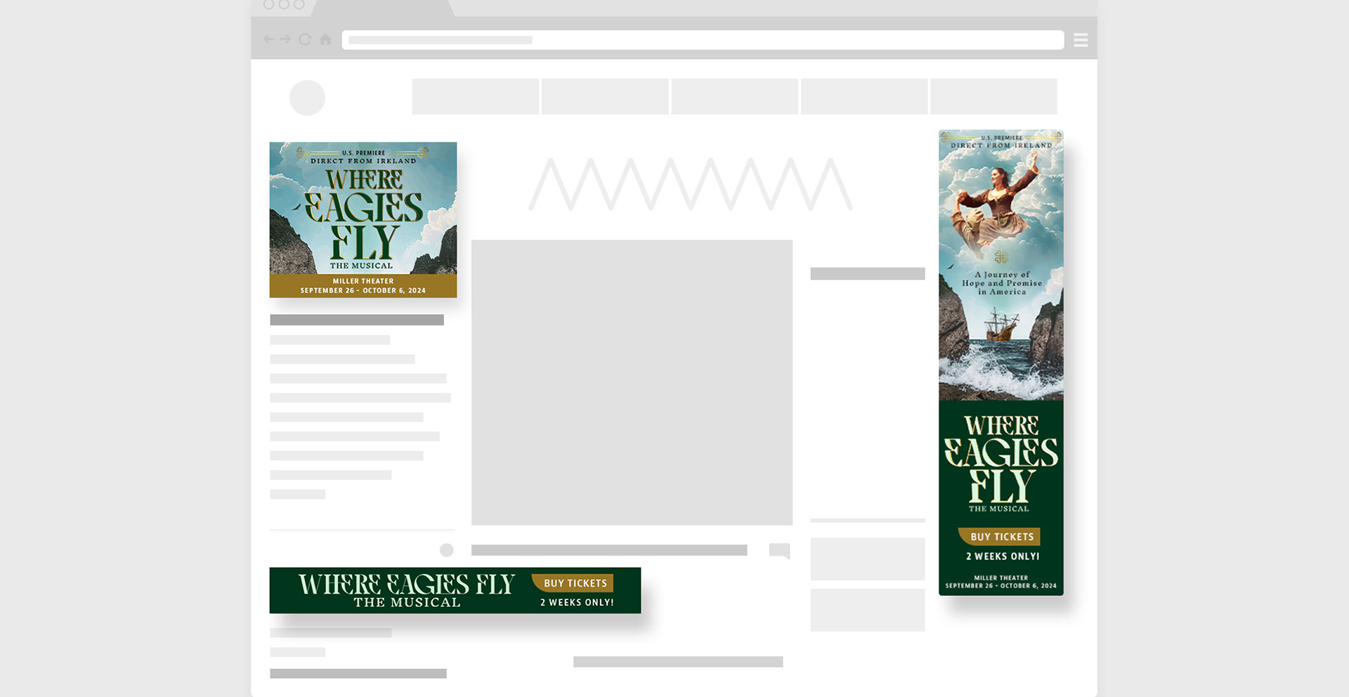
Key art, print collateral, social assets, and a multi-page front-end website design, were built around a refreshed visual identity. This identity centers on the journey from Ireland to America, using the eagle as a symbol for hope, resilience, and transformation. In the key art, the lead character appears as the eagle — a visual representation of rising above hardship. This motif ties directly to the show’s title and communicates the emotional core of the story.
Typography features curved, wing-like forms with subtle Celtic references. Tailored for Irish-American audiences, particularly women 50+, with a look that feels both rooted in heritage and refreshed for a new stage.
XXXX
A story-led identity rooted in symbolism brought cohesion and purpose to the show’s visual presence.
By combining thematic imagery with intentional typography and color, the creative direction translated the show's emotional arc into a clear and expressive visual system.