Reload Bags makes durable, functional products for cyclists aiming to raise awareness of the value of expert, local craftspeople, and sustainably made products that can be expected to last through years of abuse. Working with a team, (see pitch deck at end of page) our challenge was to create a brand identity and raise brand awareness by creating an integrated advertising campaign for Reload. With Co-Art Direction from Sydnee Ellison, I worked on the execution of the campaign, and I also played a key role in the research and strategy for the campaign. The campaign created opens up Reload from the bike sector through a campaign titled 'Made For All.'
branding / illustration / art direction / design / copy / research // rebrand / wild postings / bus shelter / bus tail / guerilla / social / promo
Key Research Findings
We dove into both secondary and primary research for Reload. For our primary research, we conducted a survey that was distributed through various channels with 367 respondents in the Philadelphia area and the surrounding suburbs. We came to learn that consumers care about their hobbies. When survey respondents were asked what physical activity they partake in, the majority of respondents filled in their own hobby rather than selecting from the five options of biking, running, hiking, swimming, and yoga. We also learned that 78.5% of respondents find functionality very important when buying a bag. We came to position our campaign around the notion that all consumers have a passion and understood that through all the diverse product offerings R.E. load has, that we can cater to any consumer hobby beyond the bike sector - a position in the marketplace unlike any direct competitor of Reload’s. And so, our big idea surrounding our campaign and brand became 'Made For All.'
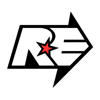
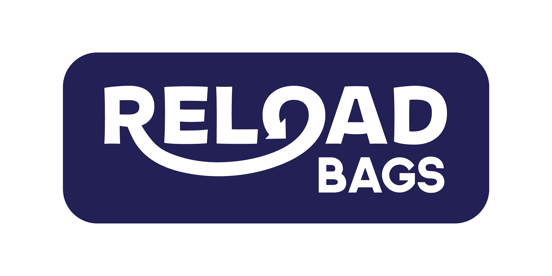
Logo Before/After
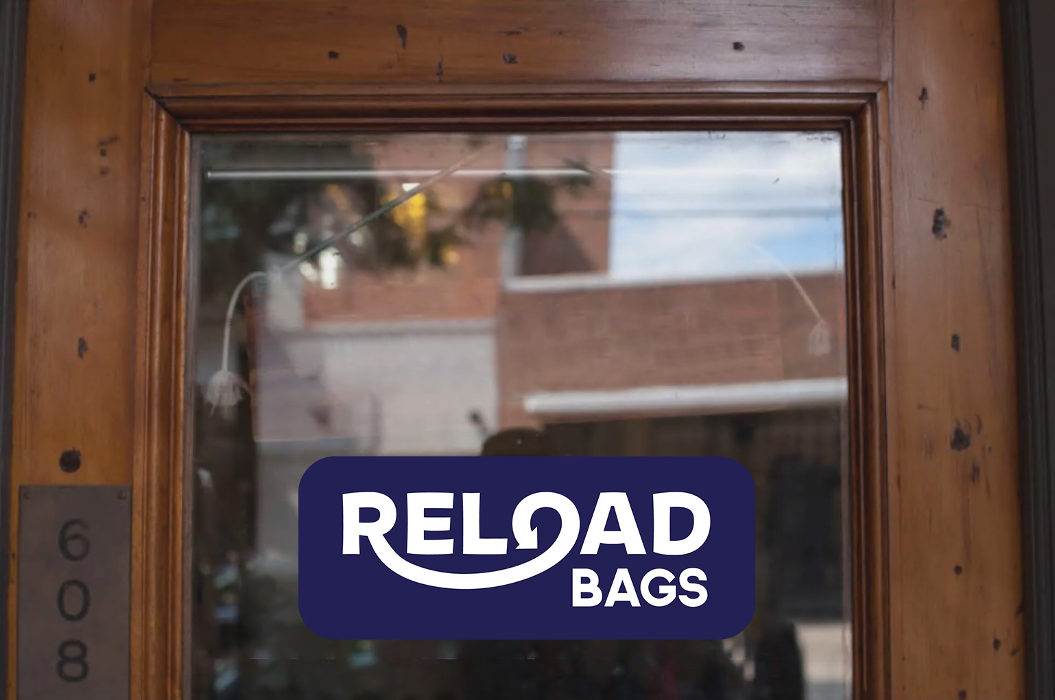
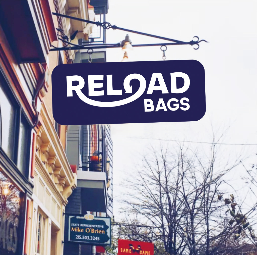
Reload’s old logo shows a definite sense of strength, which is one thing we didn’t want to lose in working towards the rebrand. However, we thought we could work to create a logo that tells Reload’s story better in the highly visual world we are living in today. The new logo is strong and the closing O is a mark for inclusivity - relating to almost all consumers' today in their personal identity and in simply wanting a new bag that’s going to complete their hobby.
Campaign Ads
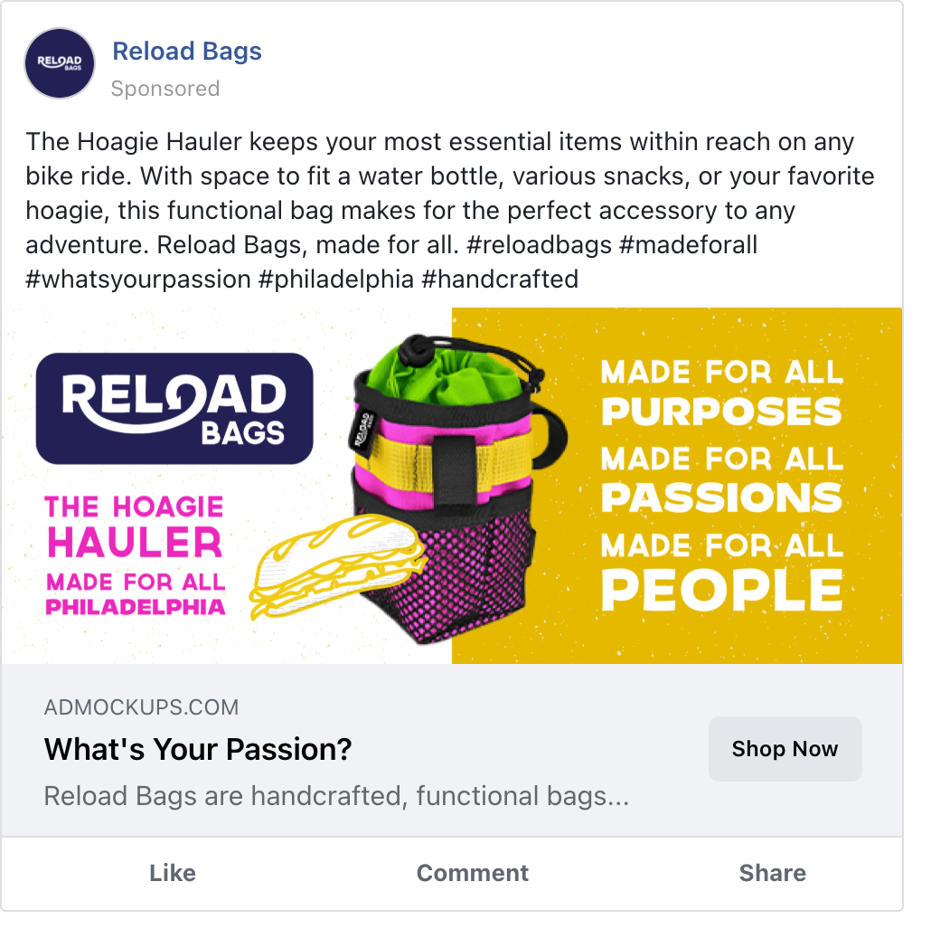
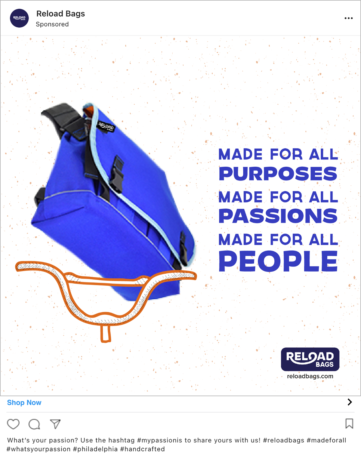
Each bag paired with a different function hit both of our findings in our creative execution of consumers caring about their hobbies and finding functionality important. Biking, gardening, hiking, and gearing the bags to Philly - each ad uses the same composition but different colorways based on the colors in the product itself.
Wild Postings
Bus Shelter
Bus Tail
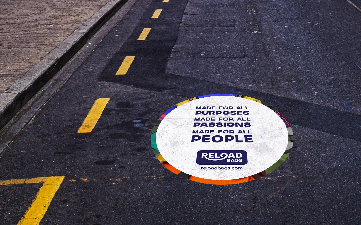
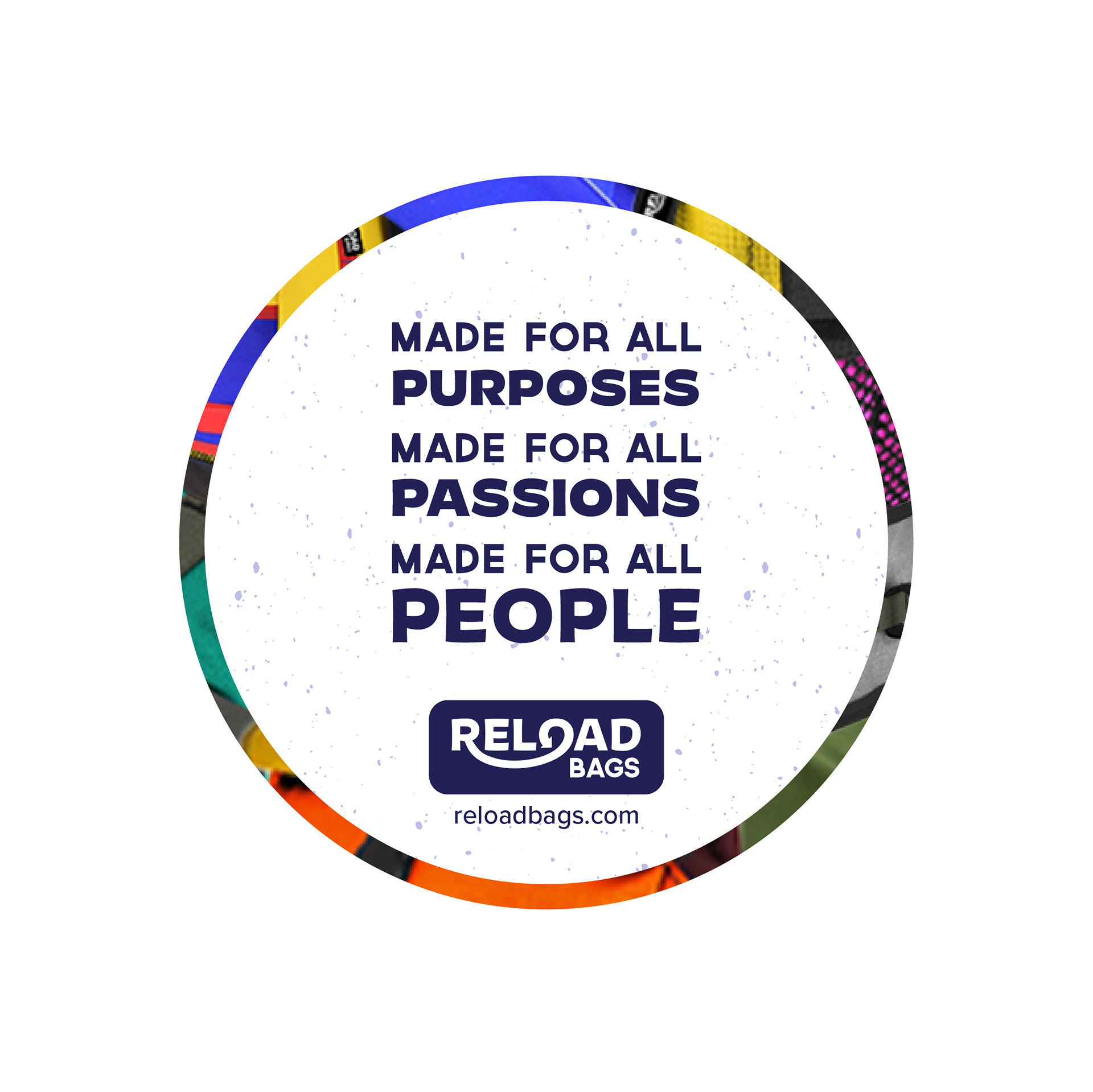
Guriella Ground Stickers
Social
Digital efforts include paid Facebook and Instagram ads, targeting consumers with captions positioning the bags as functional in their unique way and engaging social media users to share their passion using the hashtag #mypassionis.
Promotional Items
Final Pitch Deck
